Here I describe the fruits of a recent lino carving workshop my husband and I took at Graven Feather, a letter-press printing art studio in downtown Toronto. My foray into appliqué over the Fall has me curious about composing what I can only describe as “fabric paintings”: a combination of appliqué and printed designs to create a scene. Although I am told screenprinting is better for creating sparse images on the fabric, lino carving seemed to be
relatively contained, equipment-wise. Also it was cheaper to get started (~$25CDN), than investing in a screen-printing set (~$75+).
The equipment was straightforward: the lino block (here I use wood-mounted ones), carving tools, paper or fabric paint specially sold for this purpose, and a brayer (roller) to apply the paint.

On the face of it, the steps aren’t complicated either: carve the lino to create negative space, roll the paint on the block, and then press on paper or fabric.
Of course, there is an art to all the steps. For example, the idea of negative space is unusual for most of us. In lino carving you carve out what you don’t want to be printed on the sheet, and don’t carve what do want the ink to show. So a tree on a sparse background = carve everything around the tree out.
Here is my first experiment:

and the result on beautiful Japanese paper:

Notice that the ink didn’t take wherever I had made scratch marks. This is negative space in action.
Which is what makes the stenciling approach in screenprinting more appealing.On the first day of the two-day workshop, we tried our hand at the two-colour reduction technique. Here you take two sequential prints with the same block, but carve things out between the two prints. As you can see below, registering the first and second prints is important. It was hard to do with the window design I’d chosen but something to consider for the next time.

We also had to carve an image for our class project, something to do at home. Now I’ve had some sort of idée fixe about printing bare winter trees on fabric; I love the intricacy and criss-crossing of leafless branches. So I decided to carve a tree for my “main” workshop project.
Some might call it a meditative exercise, others, borderline masochism. After watching some Youtube videos, this is the method I alighted on:
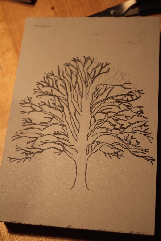
First, identify an outline you wish to carve; plenty of ‘winter tree’ images on Google, so that was no problem.Print it out and trace on tracing paper (copy #1, note the detail). I used a soft 2B pencil; this is going to be important for transferring the design.

Then, lay drawing-side-down on the lino block, tape it, and trace the image again (copy #2). This step causes the pencil markings on the flip side (from copy #1) to be transferred to the lino block. Now remove your tracing paper; hopefully your trace made it through in all details (mine mostly did).
After this, retrace your drawing (copy #3!!) in thin black Sharpie, to preserve the details while you carve. Let me tell ya: tracing a detailed tree once is one thing, but thrice!
Anyway.
Awesome, after three tracings we are ready to carve!
I spaced the carving out over three evenings. While the carving was addictive, I had to stay watchful of my impatience for getting a big portion of it each night.I periodically assessed my progress by making test prints using Speedball Fabric ink on regular printer paper. It gave me a sense of major areas where the carving needed more attention, but the results weren’t charming. This process helped me catch very early on the ineffectiveness of my first method of carving close to the thinner branches — what a disappointment that would have been at the final letter-press test!


Speedball paints are water-washable – infact I didn’t even have to use soap — and leave the Sharpie marks intact. The oil-based prints we were using at Graven Feather would have led to Sharpie erasure when cleaning the printer inks out (they use baby oil).
As you can see, the prints with the Speedball ink didn’t look too hot; I have yet ot see if it was because of the printer paper. At Graven Feather, we were able to make four prints on their gorgeous letter-press. We used beautiful, thin, textured Japanese paper of the kind sold at the wonderful Paper Place in TO.

Cool, huh? The letterpress really brought out all the details to give a crisp image.
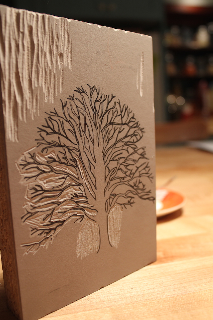
This is what the lino block looked like when I finished the carving:

Here is a close-up of the detail:

Finally we made four test prints. You can see that each one has different details emphasized, based on where the paint was applied and some stochasticity.
Can you spot the artist’s initials?


So I finally did get my wish and carve my tree. Not to mention that the carved lino block makes beautiful artwork on its own. However, for fabric art of the kind I’m thinking, screenprinting may end up being a better choice. It’s pretty painstaking to get all the background out on a block.
This winter is starting to get to me. Since indigo dyeing won’t happen till the summer, perhaps a second fabric-printing workshop would be just the thing to counter the winter blues.